
Award professional
sales tool
Award professional
sales tool
ViiV exchange Dovato IPad app
ViiV exchange Dovato IPad app
Design System
Mayor global update
Role
UX Designer
UX Designer
Expertise
Healthcare Tech
Healthcare Tech
Year
2024
2024
Intuitive access to UK HCP's
Intuitive access to UK HCP's
ViiV exchange Dovato UK Website
Over the past five years, I have led the creative development for some of the largest accounts in the highly regulated pharmaceutical industry.
Role
Sr UX/UI Designer
Design Systems
Expertise
Healthcare Tech
Year
2023
2023

The current Dovato UK website does not meet the expectations of Healthcare Professionals (HCPs), who visit with a clear and urgent purpose. The site is cluttered, visually overwhelming, and lacks an intuitive structure. This leads to frustration and negative first impressions, ultimately hindering engagement and trust.
User insights reveal that HCPs operate with a “see first, read second” mindset. However, the existing design does not align with this cognitive process. Instead, important medical content is buried, while visual elements and navigation inconsistencies create confusion. Moreover, search functionality is limited, often yielding unhelpful results.
Enhance content accessibility by eliminating clutter and improving site organization.
Implement a robust search tool to allow HCPs to quickly find essential resources such as dosing guidelines, safety information, and treatment protocols.
Redesign navigation and visual hierarchy to match how HCPs process information, ensuring that critical content is prioritized.
Create a unified, responsive, and omnichannel-driven experience that anticipates user needs and provides personalized support.


0I SITUATION
ViiV Healthcare aimed to redesign the ViiV Exchange Dovato UK website to create an omnichannel-driven, user-centric platform for healthcare professionals (HCPs)
ViiV Healthcare aimed to redesign the ViiV Exchange Dovato UK website to create an omnichannel-driven, user-centric platform for healthcare professionals (HCPs)
ViiV Healthcare aimed to redesign the ViiV Exchange Dovato UK website to create an omnichannel-driven, user-centric platform for healthcare professionals (HCPs)
Homepage overload: HCPs felt confused and disoriented due to excessive content and unclear navigation.
Poor visual hierarchy: Key clinical information lacked emphasis, making it harder for HCPs to find relevant resources quickly.
Navigation and terminology inconsistencies: Confusing nomenclature and UI elements led to inefficiencies.
HCPs’ "See First, Read Second" behavior: The existing site did not align with how HCPs process information visually.
Limited search functionality: HCPs perform six or more searches daily, but the search tool provided irrelevant results.
Fragmented content: Key sections like Coverage & Access were spread across multiple pages, making engagement difficult.


02 TASK
As the Senior UI Designer for Design Systems
Component Library Migration Adobe XD → Figma
As the Senior UI Designer for Design Systems
Component Library Migration Adobe XD → Figma
As the Senior UI Designer for Design Systems
Component Library Migration Adobe XD → Figma
Audited all Adobe XD components, identifying inconsistencies and redundant assets.
Built a scalable Figma component library using Auto Layout, Variants, and Design Tokens.
Standardized branding elements to align with ViiV Healthcare’s latest guidelines.
Created detailed Figma documentation for seamless handoff to developers.

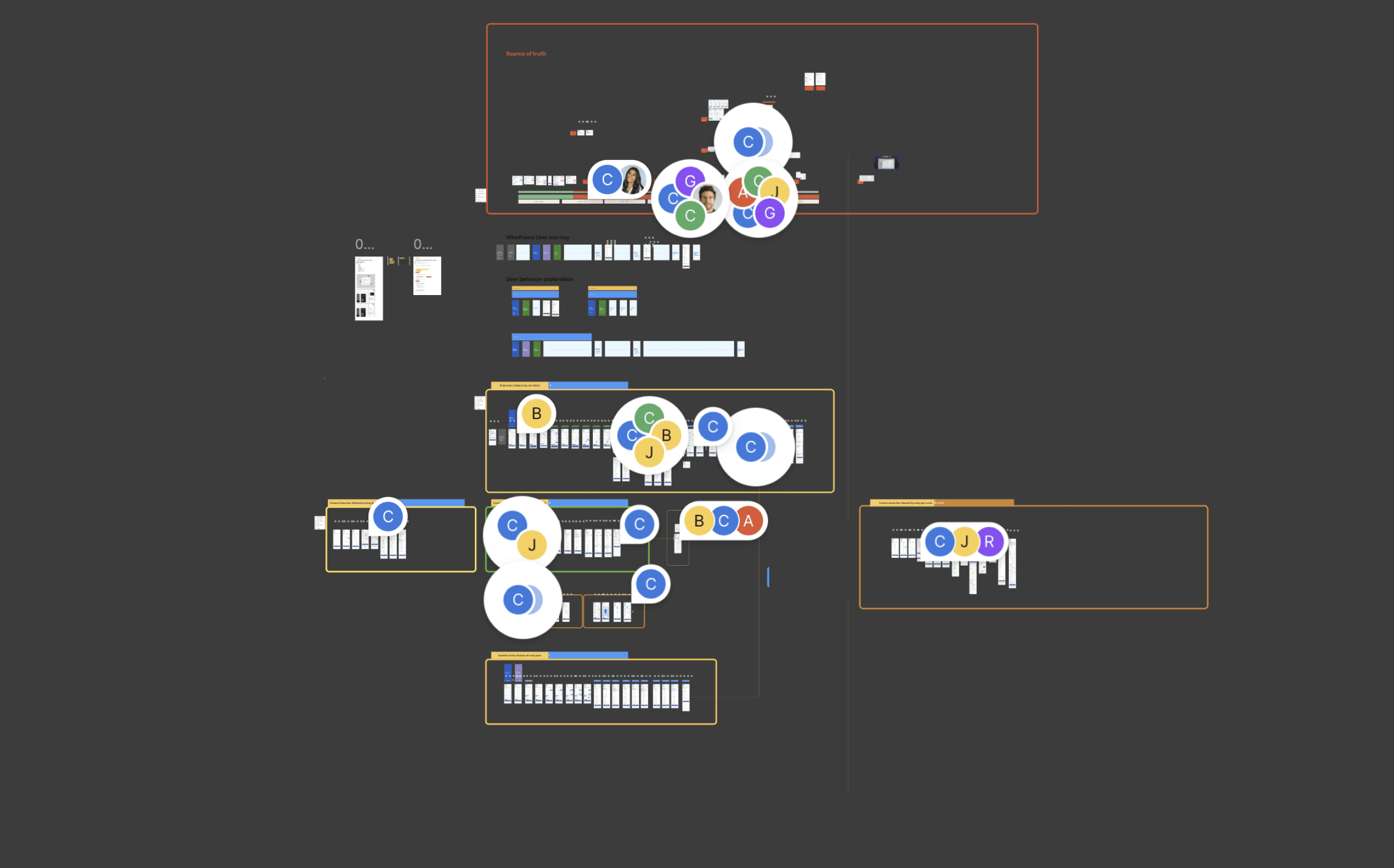
Wireframes Update to Veeva Systems
Wireframes Update to Veeva Systems
Wireframes Update to Veeva Systems
Collaborated closely with the Veeva Systems team to ensure the new architecture was both visually compelling and technically viable, optimizing performance and seamless transitions across various iPad devices.
User Flows & Journey Maps
Sitemap & Information Architecture
Low-Fidelity Wireframes
Component Library, Design System Alignment
Clickable Prototypes
Kickoff Meeting
Stakeholder Review
Usability Testing Review


03 ACTION
Redesigning the Website UX/UI
Redesigning the Website UX/UI
Redesigning the Website UX/UI
A significantly improved user interface that was visually aligned with the new Dovato brand identity, creating a more polished and professional experience.
A boost in usability with features that better supported healthcare professionals in accessing patient information quickly and easily.
Positive feedback from users who reported a more intuitive and seamless experience, improving their efficiency when managing patient care.
The app was more engaging for healthcare professionals, leading to greater adoption and frequent usage, which helped ViiV’s efforts to promote the Dovato brand in the market.
04 RESULT
Increased usability—HCPs found
clinical information 40% faster.
Increased usability—HCPs found
clinical information 40% faster.
Increased usability—HCPs found
clinical information 40% faster.
Improved User Experience: Navigation was simplified, leading to higher engagement and lower bounce rates.
Faster Content Discovery: Search enhancements reduced search time by 40%, enabling HCPs to access critical content more efficiently.
Higher Specialist Retention: Specialists, who consume 3x more content per session, increased their time spent on key resources.
Stronger Mobile Engagement: A 25% increase in mobile interactions showcased the success of the mobile-first approach.
Enhanced Perception & Trust: HCPs reported a more seamless and intuitive experience, reinforcing their trust in the platform.
File Patent
Claim Aplication
GEICO body- intake injury flow

0I SITUATION
ViiV Healthcare was in the process of rebranding its Dovato product for the UK market, with a primary focus on improving the experience for pharmaceutical representatives and healthcare professionals through touchpoints with the ViiVexchange design system, spanning an iPad app and related verticals. The app's outdated architecture and user interface presented significant usability challenges, resulting in inefficiencies for healthcare professionals when accessing and managing patient information. To ensure the app reflected the updated Dovato brand and met user needs, it required a complete overhaul in both design and functionality.
A significant opportunity to implement new workflows using Design Thinking methodologies, allowing us to build trust with the digital UK brand owner overseas.
As part of this initiative, I introduced design sprints and championed a more strategic approach to deliverables and priorities, enhancing collaboration and efficiency.
Explore A/B testing tools like Optimizely and identify the key steps in setting up a test creating variants, determining metrics, and reviewing results.

As a Senior UX Designer specializing in Design Systems, my role was to lead the complete overhaul of the Dovato iPad app's user experience. This involved aligning the app with updated brand guidelines while ensuring it was functional, intuitive, and accessible for healthcare professionals. I focused on optimizing workflows, refining user interactions, and addressing pain points that impeded the user experience. The goal was to redesign the app to offer seamless access to critical clinical information, ultimately enabling healthcare providers to manage patient care more efficiently and effectively.
02 TASK:
Designing the initial setup for the UX process: Leading the ViiV UX & design process by collaborating with developers and brand owners, utilizing bull's-eye methodologies to ensure alignment with all stakeholders.
Redesigning the sitemap: Updating the app’s information architecture to ensure it aligns with technical updates while adhering to legal requirements and brand guidelines. This involved a detailed review and restructuring of the app’s sitemap to accommodate future scalability.
Improving the app’s architecture: Enhancing the app's overall architecture to make it more efficient, functional, and intuitive for healthcare professionals by streamlining navigation and workflows.
Optimizing usability and workflows: Ensuring that the app’s design improved usability by eliminating pain points, enhancing interaction flows, and supporting seamless navigation of critical clinical information for healthcare providers.
Balancing design aesthetics with functionality: Ensuring that the redesigned app not only looked visually appealing but also remained practical, supporting healthcare professionals in their daily tasks with clear, intuitive user flows.

03 ACTION
Wireframes Update to Veeva Systems
Collaborated closely with the Veeva Systems team to ensure the new architecture was both visually compelling and technically viable, optimizing performance and seamless transitions across various iPad devices.
User Flows & Journey Maps
Sitemap & Information Architecture
Low-Fidelity Wireframes
Component Library, Design System Alignment
Clickable Prototypes
Kickoff Meeting
Stakeholder Review
Usability Testing Review
04 RESULT
The redesign of the Dovato iPad app resulted in:
A significantly improved user interface that was visually aligned with the new Dovato brand identity, creating a more polished and professional experience.
A boost in usability with features that better supported healthcare professionals in accessing patient information quickly and easily.
Positive feedback from users who reported a more intuitive and seamless experience, improving their efficiency when managing patient care.
The app was more engaging for healthcare professionals, leading to greater adoption and frequent usage, which helped ViiV’s efforts to promote the Dovato brand in the market.
04 RESULT
Increased usability—Brand representatives found
clinical information 40% faster.
Improved User Experience: Navigation was simplified, leading to higher engagement and lower bounce rates.
Faster Content Discovery: Search enhancements reduced search time by 40%, enabling HCPs to access critical content more efficiently.
Higher Specialist Retention: Specialists, who consume 3x more content per session, increased their time spent on key resources.
Stronger Mobile Engagement: A 25% increase in mobile interactions showcased the success of the mobile-first approach.
Enhanced Perception & Trust: HCPs reported a more seamless and intuitive experience, reinforcing their trust in the platform.
If you’ve made it this far, you should read more about me. Better yet, contact me to get started on a project.
Award professional
sales tool
Award professional
sales tool
ViiV exchange Dovato IPad app
ViiV exchange Dovato IPad app
Design System
Mayor global update
Role
UX Designer
UX Designer
Expertise
Healthcare Tech
Healthcare Tech
Year
2024
2024
Intuitive access to UK HCP's
Intuitive access to UK HCP's
ViiV exchange Dovato UK Website
Over the past five years, I have led the creative development for some of the largest accounts in the highly regulated pharmaceutical industry.
Role
Sr UX/UI Designer
Design Systems
Expertise
Healthcare Tech
Year
2023
2023
The current Dovato UK website does not meet the expectations of Healthcare Professionals (HCPs), who visit with a clear and urgent purpose. The site is cluttered, visually overwhelming, and lacks an intuitive structure. This leads to frustration and negative first impressions, ultimately hindering engagement and trust.
User insights reveal that HCPs operate with a “see first, read second” mindset. However, the existing design does not align with this cognitive process. Instead, important medical content is buried, while visual elements and navigation inconsistencies create confusion. Moreover, search functionality is limited, often yielding unhelpful results.
Enhance content accessibility by eliminating clutter and improving site organization.
Implement a robust search tool to allow HCPs to quickly find essential resources such as dosing guidelines, safety information, and treatment protocols.
Redesign navigation and visual hierarchy to match how HCPs process information, ensuring that critical content is prioritized.
Create a unified, responsive, and omnichannel-driven experience that anticipates user needs and provides personalized support.
0I SITUATION
ViiV Healthcare aimed to redesign the ViiV Exchange Dovato UK website to create an omnichannel-driven, user-centric platform for healthcare professionals (HCPs)
ViiV Healthcare aimed to redesign the ViiV Exchange Dovato UK website to create an omnichannel-driven, user-centric platform for healthcare professionals (HCPs)
ViiV Healthcare aimed to redesign the ViiV Exchange Dovato UK website to create an omnichannel-driven, user-centric platform for healthcare professionals (HCPs)
Homepage overload: HCPs felt confused and disoriented due to excessive content and unclear navigation.
Poor visual hierarchy: Key clinical information lacked emphasis, making it harder for HCPs to find relevant resources quickly.
Navigation and terminology inconsistencies: Confusing nomenclature and UI elements led to inefficiencies.
HCPs’ "See First, Read Second" behavior: The existing site did not align with how HCPs process information visually.
Limited search functionality: HCPs perform six or more searches daily, but the search tool provided irrelevant results.
Fragmented content: Key sections like Coverage & Access were spread across multiple pages, making engagement difficult.
02 TASK
As the Senior UI Designer for Design Systems
Component Library Migration Adobe XD → Figma
As the Senior UI Designer for Design Systems
Component Library Migration Adobe XD → Figma
As the Senior UI Designer for Design Systems
Component Library Migration Adobe XD → Figma
Audited all Adobe XD components, identifying inconsistencies and redundant assets.
Built a scalable Figma component library using Auto Layout, Variants, and Design Tokens.
Standardized branding elements to align with ViiV Healthcare’s latest guidelines.
Created detailed Figma documentation for seamless handoff to developers.
Wireframes Update to Veeva Systems
Wireframes Update to Veeva Systems
Wireframes Update to Veeva Systems
Collaborated closely with the Veeva Systems team to ensure the new architecture was both visually compelling and technically viable, optimizing performance and seamless transitions across various iPad devices.
User Flows & Journey Maps
Sitemap & Information Architecture
Low-Fidelity Wireframes
Component Library, Design System Alignment
Clickable Prototypes
Kickoff Meeting
Stakeholder Review
Usability Testing Review
03 ACTION
Redesigning the Website UX/UI
Redesigning the Website UX/UI
Redesigning the Website UX/UI
A significantly improved user interface that was visually aligned with the new Dovato brand identity, creating a more polished and professional experience.
A boost in usability with features that better supported healthcare professionals in accessing patient information quickly and easily.
Positive feedback from users who reported a more intuitive and seamless experience, improving their efficiency when managing patient care.
The app was more engaging for healthcare professionals, leading to greater adoption and frequent usage, which helped ViiV’s efforts to promote the Dovato brand in the market.
04 RESULT
Increased usability—HCPs found
clinical information 40% faster.
Increased usability—HCPs found
clinical information 40% faster.
Increased usability—HCPs found
clinical information 40% faster.
Improved User Experience: Navigation was simplified, leading to higher engagement and lower bounce rates.
Faster Content Discovery: Search enhancements reduced search time by 40%, enabling HCPs to access critical content more efficiently.
Higher Specialist Retention: Specialists, who consume 3x more content per session, increased their time spent on key resources.
Stronger Mobile Engagement: A 25% increase in mobile interactions showcased the success of the mobile-first approach.
Enhanced Perception & Trust: HCPs reported a more seamless and intuitive experience, reinforcing their trust in the platform.
File Patent
Claim Aplication
GEICO body- intake injury flow
0I SITUATION
ViiV Healthcare was in the process of rebranding its Dovato product for the UK market, with a primary focus on improving the experience for pharmaceutical representatives and healthcare professionals through touchpoints with the ViiVexchange design system, spanning an iPad app and related verticals. The app's outdated architecture and user interface presented significant usability challenges, resulting in inefficiencies for healthcare professionals when accessing and managing patient information. To ensure the app reflected the updated Dovato brand and met user needs, it required a complete overhaul in both design and functionality.
A significant opportunity to implement new workflows using Design Thinking methodologies, allowing us to build trust with the digital UK brand owner overseas.
As part of this initiative, I introduced design sprints and championed a more strategic approach to deliverables and priorities, enhancing collaboration and efficiency.
Explore A/B testing tools like Optimizely and identify the key steps in setting up a test creating variants, determining metrics, and reviewing results.
As a Senior UX Designer specializing in Design Systems, my role was to lead the complete overhaul of the Dovato iPad app's user experience. This involved aligning the app with updated brand guidelines while ensuring it was functional, intuitive, and accessible for healthcare professionals. I focused on optimizing workflows, refining user interactions, and addressing pain points that impeded the user experience. The goal was to redesign the app to offer seamless access to critical clinical information, ultimately enabling healthcare providers to manage patient care more efficiently and effectively.
02 TASK:
Designing the initial setup for the UX process: Leading the ViiV UX & design process by collaborating with developers and brand owners, utilizing bull's-eye methodologies to ensure alignment with all stakeholders.
Redesigning the sitemap: Updating the app’s information architecture to ensure it aligns with technical updates while adhering to legal requirements and brand guidelines. This involved a detailed review and restructuring of the app’s sitemap to accommodate future scalability.
Improving the app’s architecture: Enhancing the app's overall architecture to make it more efficient, functional, and intuitive for healthcare professionals by streamlining navigation and workflows.
Optimizing usability and workflows: Ensuring that the app’s design improved usability by eliminating pain points, enhancing interaction flows, and supporting seamless navigation of critical clinical information for healthcare providers.
Balancing design aesthetics with functionality: Ensuring that the redesigned app not only looked visually appealing but also remained practical, supporting healthcare professionals in their daily tasks with clear, intuitive user flows.
03 ACTION
Wireframes Update to Veeva Systems
Collaborated closely with the Veeva Systems team to ensure the new architecture was both visually compelling and technically viable, optimizing performance and seamless transitions across various iPad devices.
User Flows & Journey Maps
Sitemap & Information Architecture
Low-Fidelity Wireframes
Component Library, Design System Alignment
Clickable Prototypes
Kickoff Meeting
Stakeholder Review
Usability Testing Review
04 RESULT
The redesign of the Dovato iPad app resulted in:
A significantly improved user interface that was visually aligned with the new Dovato brand identity, creating a more polished and professional experience.
A boost in usability with features that better supported healthcare professionals in accessing patient information quickly and easily.
Positive feedback from users who reported a more intuitive and seamless experience, improving their efficiency when managing patient care.
The app was more engaging for healthcare professionals, leading to greater adoption and frequent usage, which helped ViiV’s efforts to promote the Dovato brand in the market.
04 RESULT
Increased usability—Brand representatives found
clinical information 40% faster.
Improved User Experience: Navigation was simplified, leading to higher engagement and lower bounce rates.
Faster Content Discovery: Search enhancements reduced search time by 40%, enabling HCPs to access critical content more efficiently.
Higher Specialist Retention: Specialists, who consume 3x more content per session, increased their time spent on key resources.
Stronger Mobile Engagement: A 25% increase in mobile interactions showcased the success of the mobile-first approach.
Enhanced Perception & Trust: HCPs reported a more seamless and intuitive experience, reinforcing their trust in the platform.
If you’ve made it this far, you should read more about me. Better yet, contact me to get started on a project.