0I SITUATION
Homepage overload: HCPs felt confused and disoriented due to excessive content and unclear navigation.
Poor visual hierarchy: Key clinical information lacked emphasis, making it harder for HCPs to find relevant resources quickly.
Navigation and terminology inconsistencies: Confusing nomenclature and UI elements led to inefficiencies.
HCPs’ "See First, Read Second" behavior: The existing site did not align with how HCPs process information visually.
Limited search functionality: HCPs perform six or more searches daily, but the search tool provided irrelevant results.
Fragmented content: Key sections like Coverage & Access were spread across multiple pages, making engagement difficult.


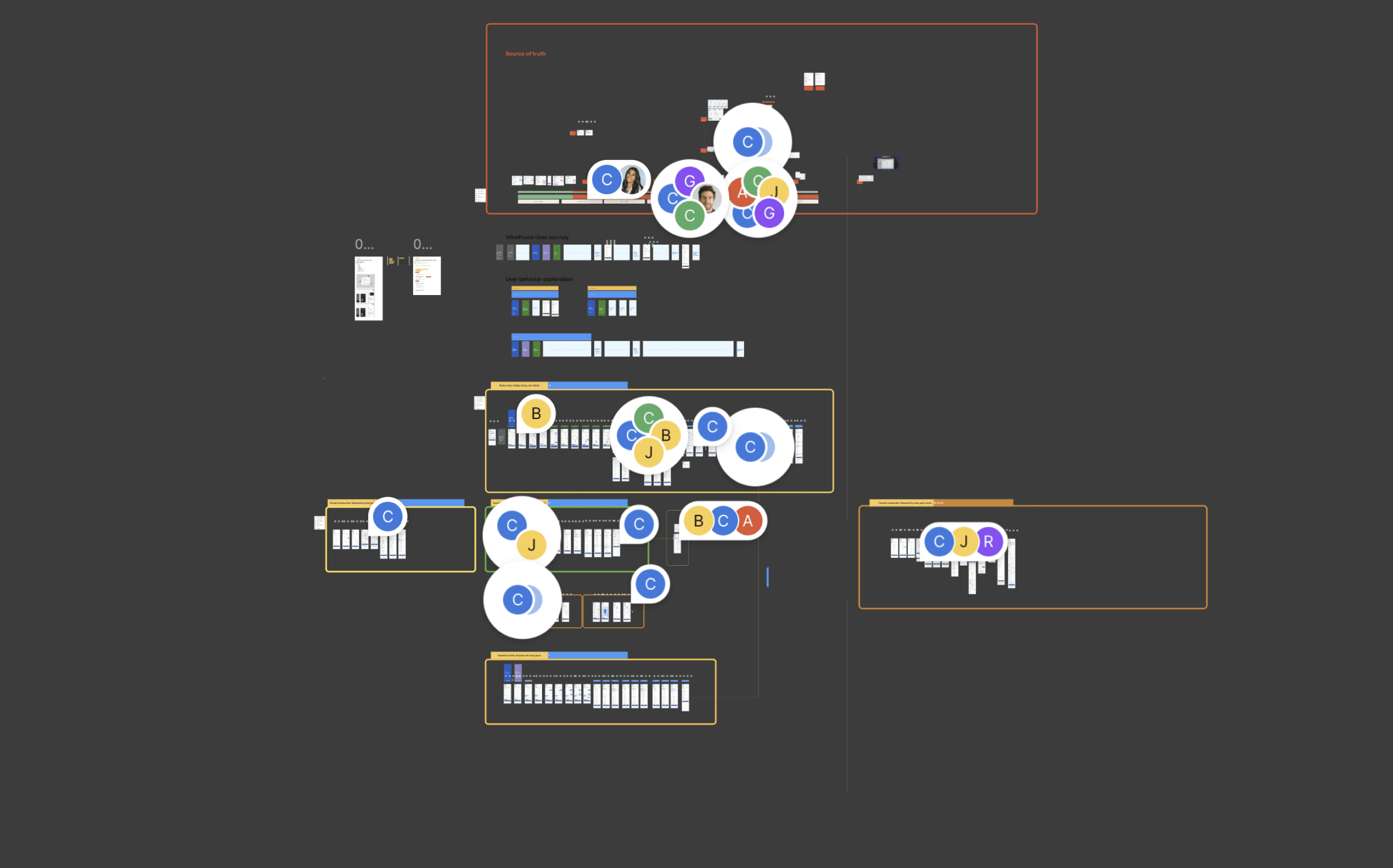
02 TASK
Audited all Adobe XD components, identifying inconsistencies and redundant assets.
Built a scalable Figma component library using Auto Layout, Variants, and Design Tokens.
Standardized branding elements to align with ViiV Healthcare’s latest guidelines.
Created detailed Figma documentation for seamless handoff to developers.

Collaborated closely with the Veeva Systems team to ensure the new architecture was both visually compelling and technically viable, optimizing performance and seamless transitions across various iPad devices.
User Flows & Journey Maps
Sitemap & Information Architecture
Low-Fidelity Wireframes
Component Library, Design System Alignment
Clickable Prototypes
Kickoff Meeting
Stakeholder Review
Usability Testing Review


03 ACTION
A significantly improved user interface that was visually aligned with the new Dovato brand identity, creating a more polished and professional experience.
A boost in usability with features that better supported healthcare professionals in accessing patient information quickly and easily.
Positive feedback from users who reported a more intuitive and seamless experience, improving their efficiency when managing patient care.
The app was more engaging for healthcare professionals, leading to greater adoption and frequent usage, which helped ViiV’s efforts to promote the Dovato brand in the market.
04 RESULT
Improved User Experience: Navigation was simplified, leading to higher engagement and lower bounce rates.
Faster Content Discovery: Search enhancements reduced search time by 40%, enabling HCPs to access critical content more efficiently.
Higher Specialist Retention: Specialists, who consume 3x more content per session, increased their time spent on key resources.
Stronger Mobile Engagement: A 25% increase in mobile interactions showcased the success of the mobile-first approach.
Enhanced Perception & Trust: HCPs reported a more seamless and intuitive experience, reinforcing their trust in the platform.