GEICO body-intakke injury flow


The
Challenge
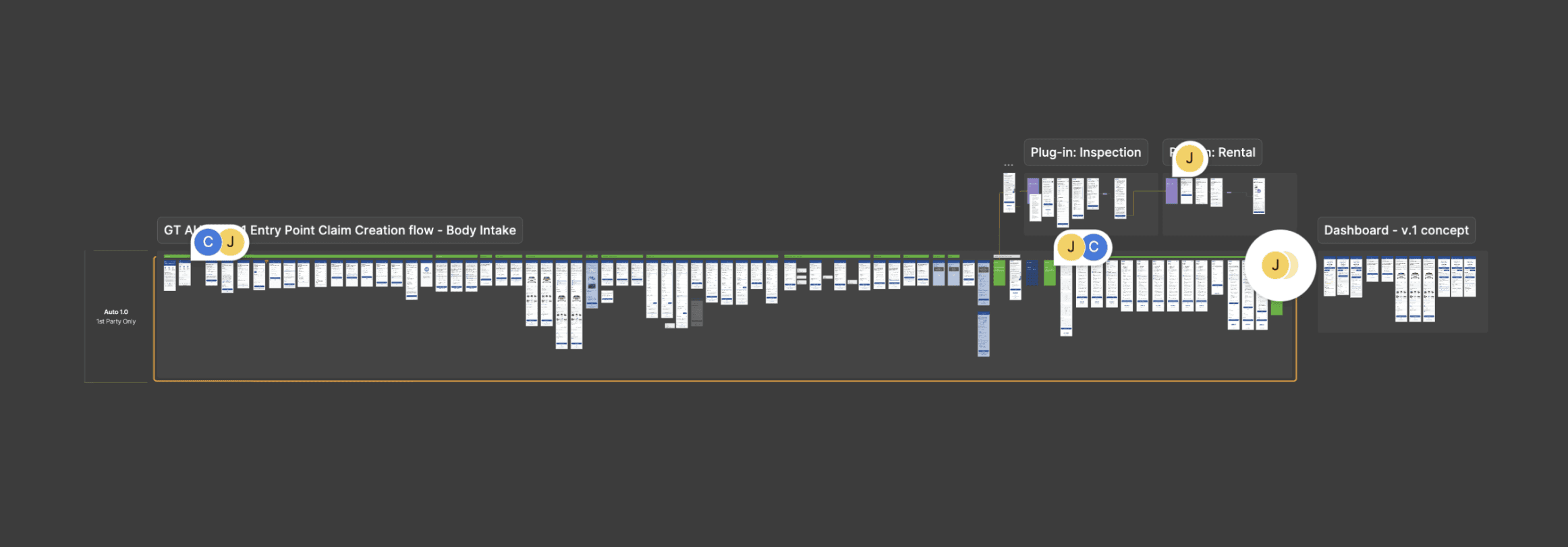
The Injury Intake app was built by an internal engineering team with 20 years of company experience, but without JavaScript experience, user research, or testing.
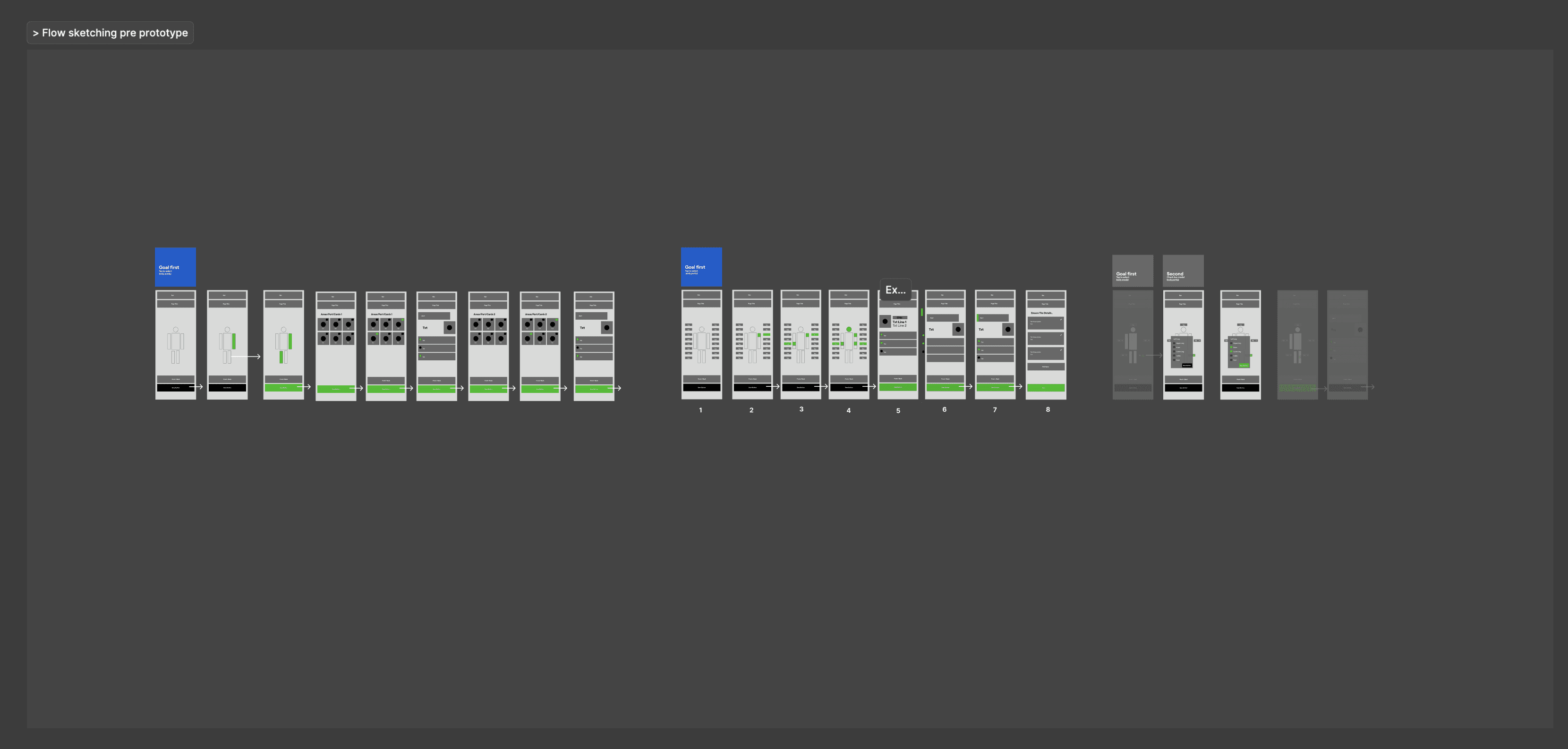
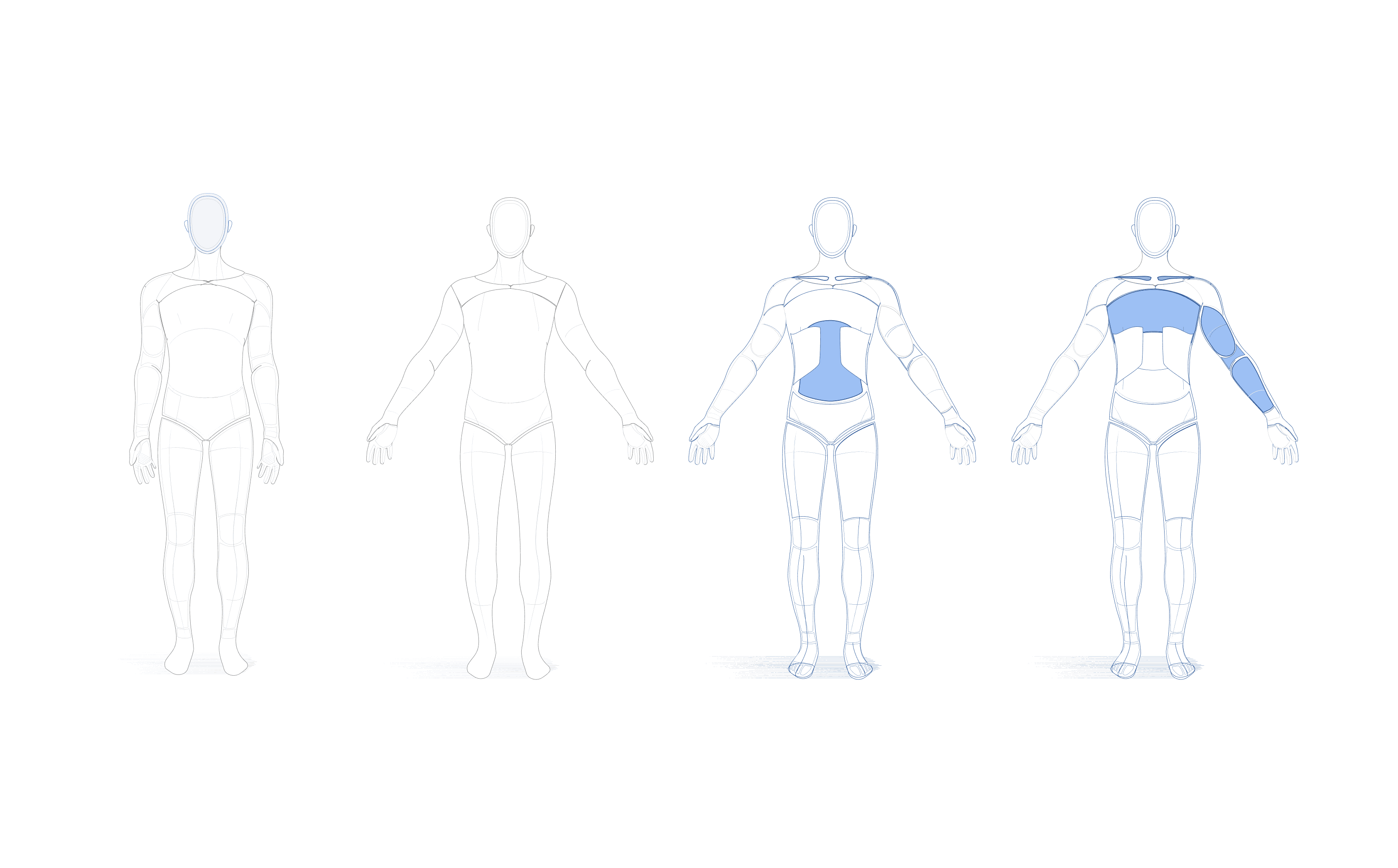
They implemented a one-question-per-page flow for the app, featuring a doll that outlined the human body. However, this approach resulted in 34,000 customers dropping off during the experience when they faced injury-related questions, prompting them to call an adjuster rather than complete the process.

The
Evidence
The insight pointed to a two-part strategy to improve UX, reduce drop-off, and clarify additional abandonment archetypes for business partners.
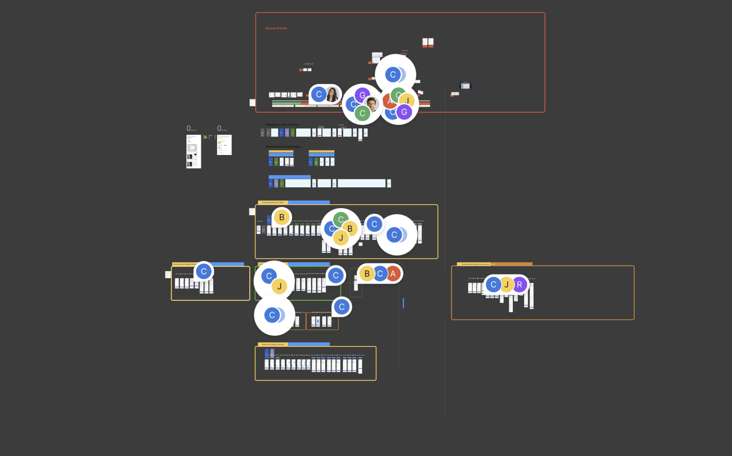
Share enough evidence to present to business partners, outlining findings that support pivoting the research toward the adjusters’ call center to learn how to humanize the flow for customers during the emotional journey of reporting a claim, grounded in resonance practices.
The
Testing
Research revealed that the FNOL experience often conflicts with customers’ emotional state after an accident, creating confusion, hesitation, and anxiety. Participants struggled to know when they could pause, what information would be required next, and how to review what they had submitted.
While the Body Map was intuitive and well-received, accuracy suffered when customers lacked diagnoses or were pushed to provide details before they felt ready. Clear signaling, reassurance, and flexible timing emerged as critical to helping customers feel supported, confident, and in control—reducing abandonment, misreporting, and unnecessary escalation to associates or legal support.
Align FNOL flow with post-accident mental states through reassurance and clear expectations.
Improve transparency: preview upcoming questions and allow review of submitted information.
Support accuracy by enabling progressive injury reporting without pressure.





The
Patent
Illustration
.

File Patent
Claim Aplication
GEICO body- intake injury flow


The Challenge
The Injury Intake app was built by an internal engineering team with 20 years of company experience, but without JavaScript experience, user research, or testing.
They implemented a one-question-per-page flow for the app, featuring a doll that outlined the human body. However, this approach resulted in 34,000 customers dropping off during the experience when they faced injury-related questions, prompting them to call an adjuster rather than complete the process.


The insight pointed to a two-part strategy to improve UX, reduce drop-off, and clarify additional abandonment archetypes for business partners.
Evidence
Share enough evidence to present to business partners, outlining findings that support pivoting the research toward the adjusters’ call center to learn how to humanize the flow for customers during the emotional journey of reporting a claim, grounded in resonance practices.
Testing
Research revealed that the FNOL experience often conflicts with customers’ emotional state after an accident, creating confusion, hesitation, and anxiety. Participants struggled to know when they could pause, what information would be required next, and how to review what they had submitted.
While the Body Map was intuitive and well-received, accuracy suffered when customers lacked diagnoses or were pushed to provide details before they felt ready. Clear signaling, reassurance, and flexible timing emerged as critical to helping customers feel supported, confident, and in control—reducing abandonment, misreporting, and unnecessary escalation to associates or legal support.
Align FNOL flow with post-accident mental states through reassurance and clear expectations.
Improve transparency: preview upcoming questions and allow review of submitted information.
Support accuracy by enabling progressive injury reporting without pressure.
Paten
A significantly improved user interface that was visually aligned with the new Dovato brand identity, creating a more polished and professional experience.
A boost in usability with features that better supported healthcare professionals in accessing patient information quickly and easily.
Positive feedback from users who reported a more intuitive and seamless experience, improving their efficiency when managing patient care.
The app was more engaging for healthcare professionals, leading to greater adoption and frequent usage, which helped ViiV’s efforts to promote the Dovato brand in the market.


04 RESULT
Increased usability—Brand representatives found
clinical information 40% faster.
Improved User Experience: Navigation was simplified, leading to higher engagement and lower bounce rates.
Faster Content Discovery: Search enhancements reduced search time by 40%, enabling HCPs to access critical content more efficiently.
Higher Specialist Retention: Specialists, who consume 3x more content per session, increased their time spent on key resources.
Stronger Mobile Engagement: A 25% increase in mobile interactions showcased the success of the mobile-first approach.
Enhanced Perception & Trust: HCPs reported a more seamless and intuitive experience, reinforcing their trust in the platform.
If you’ve made it this far, you should read more about me. Better yet, contact me to get started on a project.
