

PRODUCT
BEST
BEST
TOOL
TOOL
SALES BEST UK
Ipad
app
IPAD APP
Ipad app
What I bring as a
Senior UX Designer, Design Systems at McCann Health
What I bring as a
Senior UX Designer, Design Systems at McCann Health
What I bring as a Senior UX Designer, Design Systems at McCann Health
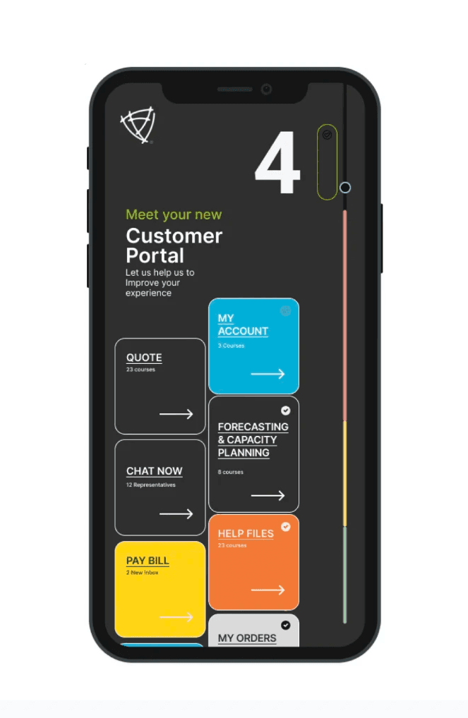
As a Senior UX Designer specializing in Design Systems, my role was to lead the complete overhaul of the Dovato iPad app's user experience. This involved aligning the app with updated brand guidelines while ensuring it was functional, intuitive, and accessible for healthcare professionals. I focused on optimizing workflows, refining user interactions, and addressing pain points that impeded the user experience. The goal was to redesign the app to offer seamless access to critical clinical information, ultimately enabling healthcare providers to manage patient care more efficiently and effectively.
Challenge :
ViiV Healthcare was in the process of rebranding its Dovato product for the UK market, with a primary focus on improving the experience for pharmaceutical representatives and healthcare professionals through touchpoints with the ViiVexchange design system, spanning an iPad app and related verticals. The app's outdated architecture and user interface presented significant usability challenges, resulting in inefficiencies for healthcare professionals when accessing and managing patient information. To ensure the app reflected the updated Dovato brand and met user needs, it required a complete overhaul in both design and functionality.
Check the entire CASE BELOW
My process blends strategy and creativity to address challenges, craft solutions, and deliver designs that effectively communicate your message.


Check the entire CASE BELOW
SUMMARY
ViiV Healthcare was in the process of rebranding its Dovato product for the UK market, with a primary focus on improving the experience for pharmaceutical representatives and healthcare professionals through touchpoints with the ViiVexchange design system, spanning an iPad app and related verticals. The app's outdated architecture and user interface presented significant usability challenges, resulting in inefficiencies for healthcare professionals when accessing and managing patient information. To ensure the app reflected the updated Dovato brand and met user needs, it required a complete overhaul in both design and functionality.
ViiV Healthcare was in the process of rebranding its Dovato product for the UK market, with a primary focus on improving the experience for pharmaceutical representatives and healthcare professionals through touchpoints with the ViiVexchange design system, spanning an iPad app and related verticals. The app's outdated architecture and user interface presented significant usability challenges, resulting in inefficiencies for healthcare professionals when accessing and managing patient information. To ensure the app reflected the updated Dovato brand and met user needs, it required a complete overhaul in both design and functionality.
A significant opportunity to implement new workflows using Design Thinking methodologies, allowing us to build trust with the digital UK brand owner overseas.
As part of this initiative, I introduced design sprints and championed a more strategic approach to deliverables and priorities, enhancing collaboration and efficiency.
Explore A/B testing tools like Optimizely and identify the key steps in setting up a test creating variants, determining metrics, and reviewing results.
As a Senior UX Designer specializing in Design Systems, my role was to lead the complete overhaul of the Dovato iPad app's user experience. This involved aligning the app with updated brand guidelines while ensuring it was functional, intuitive, and accessible for healthcare professionals. I focused on optimizing workflows, refining user interactions, and addressing pain points that impeded the user experience. The goal was to redesign the app to offer seamless access to critical clinical information, ultimately enabling healthcare providers to manage patient care more efficiently and effectively.
As a Senior UX Designer specializing in Design Systems, my role was to lead the complete overhaul of the Dovato iPad app's user experience. This involved aligning the app with updated brand guidelines while ensuring it was functional, intuitive, and accessible for healthcare professionals. I focused on optimizing workflows, refining user interactions, and addressing pain points that impeded the user experience. The goal was to redesign the app to offer seamless access to critical clinical information, ultimately enabling healthcare providers to manage patient care more efficiently and effectively.
02 TASK:
Designing the initial setup for the UX process: Leading the ViiV UX & design process by collaborating with developers and brand owners, utilizing bull's-eye methodologies to ensure alignment with all stakeholders.
Redesigning the sitemap: Updating the app’s information architecture to ensure it aligns with technical updates while adhering to legal requirements and brand guidelines. This involved a detailed review and restructuring of the app’s sitemap to accommodate future scalability.
Improving the app’s architecture: Enhancing the app's overall architecture to make it more efficient, functional, and intuitive for healthcare professionals by streamlining navigation and workflows.
Optimizing usability and workflows: Ensuring that the app’s design improved usability by eliminating pain points, enhancing interaction flows, and supporting seamless navigation of critical clinical information for healthcare providers.
Balancing design aesthetics with functionality: Ensuring that the redesigned app not only looked visually appealing but also remained practical, supporting healthcare professionals in their daily tasks with clear, intuitive user flows.


03 ACTION
Wireframes Update to Veeva Systems
Collaborated closely with the Veeva Systems team to ensure the new architecture was both visually compelling and technically viable, optimizing performance and seamless transitions across various iPad devices.
User Flows & Journey Maps
Sitemap & Information Architecture
Low-Fidelity Wireframes
Component Library, Design System Alignment
Clickable Prototypes
Kickoff Meeting
Stakeholder Review
Usability Testing Review


04 RESULT
The redesign of the Dovato iPad app resulted in:
A significantly improved user interface that was visually aligned with the new Dovato brand identity, creating a more polished and professional experience.
A boost in usability with features that better supported healthcare professionals in accessing patient information quickly and easily.
Positive feedback from users who reported a more intuitive and seamless experience, improving their efficiency when managing patient care.
The app was more engaging for healthcare professionals, leading to greater adoption and frequent usage, which helped ViiV’s efforts to promote the Dovato brand in the market.


OUTCOME
Increased usability—Brand representatives found
clinical information 40% faster.
Improved User Experience: Navigation was simplified, leading to higher engagement and lower bounce rates.
Faster Content Discovery: Search enhancements reduced search time by 40%, enabling HCPs to access critical content more efficiently.
Higher Specialist Retention: Specialists, who consume 3x more content per session, increased their time spent on key resources.
Stronger Mobile Engagement: A 25% increase in mobile interactions showcased the success of the mobile-first approach.
Enhanced Perception & Trust: HCPs reported a more seamless and intuitive experience, reinforcing their trust in the platform.

PRODUCT
BEST
BEST
TOOL
TOOL
SALES BEST UK
Ipad
app
IPAD APP
Ipad app
What I bring as a
Senior UX Designer, Design Systems at McCann Health
What I bring as a
Senior UX Designer, Design Systems at McCann Health
What I bring as a Senior UX Designer, Design Systems at McCann Health
As a Senior UX Designer specializing in Design Systems, my role was to lead the complete overhaul of the Dovato iPad app's user experience. This involved aligning the app with updated brand guidelines while ensuring it was functional, intuitive, and accessible for healthcare professionals. I focused on optimizing workflows, refining user interactions, and addressing pain points that impeded the user experience. The goal was to redesign the app to offer seamless access to critical clinical information, ultimately enabling healthcare providers to manage patient care more efficiently and effectively.
Challenge :
ViiV Healthcare was in the process of rebranding its Dovato product for the UK market, with a primary focus on improving the experience for pharmaceutical representatives and healthcare professionals through touchpoints with the ViiVexchange design system, spanning an iPad app and related verticals. The app's outdated architecture and user interface presented significant usability challenges, resulting in inefficiencies for healthcare professionals when accessing and managing patient information. To ensure the app reflected the updated Dovato brand and met user needs, it required a complete overhaul in both design and functionality.
Check the entire CASE BELOW
My process blends strategy and creativity to address challenges, craft solutions, and deliver designs that effectively communicate your message.
Check the entire CASE BELOW
SUMMARY
ViiV Healthcare was in the process of rebranding its Dovato product for the UK market, with a primary focus on improving the experience for pharmaceutical representatives and healthcare professionals through touchpoints with the ViiVexchange design system, spanning an iPad app and related verticals. The app's outdated architecture and user interface presented significant usability challenges, resulting in inefficiencies for healthcare professionals when accessing and managing patient information. To ensure the app reflected the updated Dovato brand and met user needs, it required a complete overhaul in both design and functionality.
ViiV Healthcare was in the process of rebranding its Dovato product for the UK market, with a primary focus on improving the experience for pharmaceutical representatives and healthcare professionals through touchpoints with the ViiVexchange design system, spanning an iPad app and related verticals. The app's outdated architecture and user interface presented significant usability challenges, resulting in inefficiencies for healthcare professionals when accessing and managing patient information. To ensure the app reflected the updated Dovato brand and met user needs, it required a complete overhaul in both design and functionality.
A significant opportunity to implement new workflows using Design Thinking methodologies, allowing us to build trust with the digital UK brand owner overseas.
As part of this initiative, I introduced design sprints and championed a more strategic approach to deliverables and priorities, enhancing collaboration and efficiency.
Explore A/B testing tools like Optimizely and identify the key steps in setting up a test creating variants, determining metrics, and reviewing results.
As a Senior UX Designer specializing in Design Systems, my role was to lead the complete overhaul of the Dovato iPad app's user experience. This involved aligning the app with updated brand guidelines while ensuring it was functional, intuitive, and accessible for healthcare professionals. I focused on optimizing workflows, refining user interactions, and addressing pain points that impeded the user experience. The goal was to redesign the app to offer seamless access to critical clinical information, ultimately enabling healthcare providers to manage patient care more efficiently and effectively.
As a Senior UX Designer specializing in Design Systems, my role was to lead the complete overhaul of the Dovato iPad app's user experience. This involved aligning the app with updated brand guidelines while ensuring it was functional, intuitive, and accessible for healthcare professionals. I focused on optimizing workflows, refining user interactions, and addressing pain points that impeded the user experience. The goal was to redesign the app to offer seamless access to critical clinical information, ultimately enabling healthcare providers to manage patient care more efficiently and effectively.
02 TASK:
Designing the initial setup for the UX process: Leading the ViiV UX & design process by collaborating with developers and brand owners, utilizing bull's-eye methodologies to ensure alignment with all stakeholders.
Redesigning the sitemap: Updating the app’s information architecture to ensure it aligns with technical updates while adhering to legal requirements and brand guidelines. This involved a detailed review and restructuring of the app’s sitemap to accommodate future scalability.
Improving the app’s architecture: Enhancing the app's overall architecture to make it more efficient, functional, and intuitive for healthcare professionals by streamlining navigation and workflows.
Optimizing usability and workflows: Ensuring that the app’s design improved usability by eliminating pain points, enhancing interaction flows, and supporting seamless navigation of critical clinical information for healthcare providers.
Balancing design aesthetics with functionality: Ensuring that the redesigned app not only looked visually appealing but also remained practical, supporting healthcare professionals in their daily tasks with clear, intuitive user flows.
03 ACTION
Wireframes Update to Veeva Systems
Collaborated closely with the Veeva Systems team to ensure the new architecture was both visually compelling and technically viable, optimizing performance and seamless transitions across various iPad devices.
User Flows & Journey Maps
Sitemap & Information Architecture
Low-Fidelity Wireframes
Component Library, Design System Alignment
Clickable Prototypes
Kickoff Meeting
Stakeholder Review
Usability Testing Review
04 RESULT
The redesign of the Dovato iPad app resulted in:
A significantly improved user interface that was visually aligned with the new Dovato brand identity, creating a more polished and professional experience.
A boost in usability with features that better supported healthcare professionals in accessing patient information quickly and easily.
Positive feedback from users who reported a more intuitive and seamless experience, improving their efficiency when managing patient care.
The app was more engaging for healthcare professionals, leading to greater adoption and frequent usage, which helped ViiV’s efforts to promote the Dovato brand in the market.
OUTCOME
Increased usability—Brand representatives found
clinical information 40% faster.
Improved User Experience: Navigation was simplified, leading to higher engagement and lower bounce rates.
Faster Content Discovery: Search enhancements reduced search time by 40%, enabling HCPs to access critical content more efficiently.
Higher Specialist Retention: Specialists, who consume 3x more content per session, increased their time spent on key resources.
Stronger Mobile Engagement: A 25% increase in mobile interactions showcased the success of the mobile-first approach.
Enhanced Perception & Trust: HCPs reported a more seamless and intuitive experience, reinforcing their trust in the platform.